 Introduction
 Archive
 Projects
 Gallery Blocks
 Social Feeds
 Proofing
 Saved Layouts and Shortcodes
 Settings
 FAQ
FAQ Troubleshooting
 Developers
Table of Contents
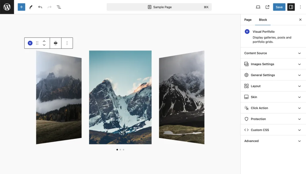
The Slider layout is designed to show your gallery items in a slider and carousel view, perfect for interactive displays.
Available Settings
- Effect – Choose from three carousel effects: Slide, Coverflow, and Fade.
- Speed (in Seconds) – Adjust this value to set the duration of the effect while changing a slide.
- Autoplay (in Seconds) – Set the interval for changing slides. Set to zero to turn off the autoplay feature.
- Pause on Mouse Over – Stop autoplay when you hover over items.
- Items Height
- Auto – Display images in their original aspect ratio.
- Static (px) – Set the height of the slides in pixels for a fixed height.
- Dynamic (%) – Set the height of the slides in percentage, allowing the height to change depending on the size of the browser window.
- Items Minimal Height – Set the minimum height. For a fullscreen carousel, type
100vhto make it 100% of the screen height. - Slides Per View (not available with Fade skin)
- Auto – Slide width is calculated automatically, and the dynamic height is counted from the width of the carousel.
- Custom – Set the number of slides visible on the screen at the same time.
- Centered Slides (not available with Fade skin) – Display the active gallery item centered. If not selected, the active carousel will be on the left side.
- Loop – Enable looping your carousel so it does not have an end.
- Free Scroll – Make slides not have fixed positions while sliding manually.
- Display Arrows – Show arrows for carousel navigation.
- Display Bullets – Show bullets for carousel navigation, appearing below the carousel by default.
- Dynamic Bullets – Show bullets only for the slides currently shown on the page.
- Mousewheel Control – Scroll your carousel using the mousewheel.
- Display Thumbnails – Show thumbnails of slides for carousel navigation.
- These settings are the same as for the normal carousel (described below).
- Gap – Set the spacing between slides.
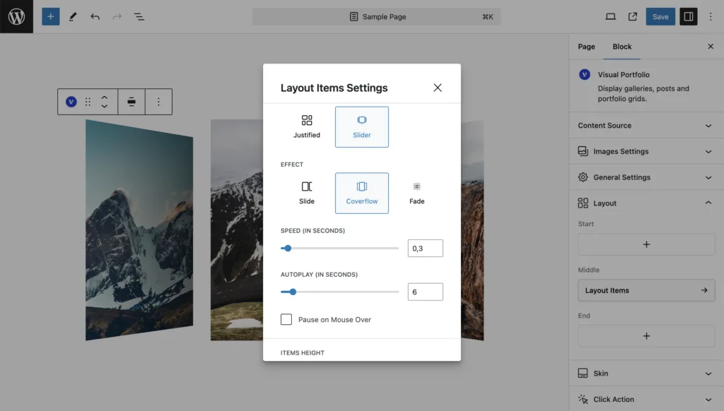
Effect
Choose from three carousel effects:
- Slide: Standard sliding transition.
- Coverflow: 3D-like effect where slides overlap.
- Fade: Smooth fade transition between slides.
Speed and Autoplay
- Speed: Set the duration of the transition effect in seconds.
- Autoplay: Set the interval between slide changes. Set to 0 to disable autoplay.
- Pause on Mouse Over: Toggle this option to pause autoplay when the user hovers over the slider.
Items Height
Choose how to set the height of your slider items:
- Auto: Uses the original aspect ratio of your images.
- Static (px): Set a fixed height in pixels.
- Dynamic (%): Set a percentage height relative to the slider’s width.
Items Minimal Height allows you to set a minimum height, useful for responsive designs.
Slides Per View
- Auto: Automatically calculates the number of visible slides.
- Custom: Manually set the number of slides visible at once.
Centered Slides option centers the active slide when enabled.
Navigation Options
- Loop: Enable to make the slider loop continuously.
- Free Scroll: Allow free scrolling without snapping to slides.
- Display Arrows: Show navigation arrows.
- Display Bullets: Show navigation bullets.
- Dynamic Bullets: Only show bullets for visible slides.
- Mousewheel Control: Enable scrolling the slider with the mousewheel.
- Display Thumbnails: Show thumbnail navigation.
Gap
Set the spacing between slides using the Gap setting.